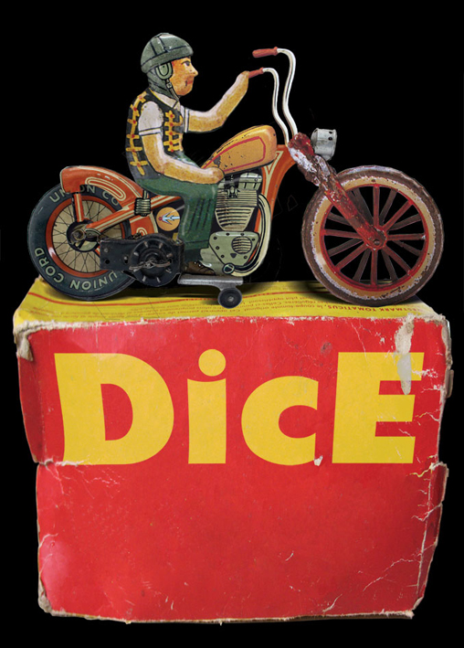
Tuesday 30 November 2010

Fly Postin'

Here's some more posters - all made for The Chambers, a bar/restaurant in Folkestone.
And here's one that never happened... a ghostly apparition of a poster! I quite like the crosshatch effect  in the lettering - I might use that again one day.

Self promotion - the old way

I don't get the opportunity very often to paint the kind of signs I love - that is, proper old-school signwriting, block and shadow, decoration for the fun of it, etc. My mum kindly allowed me to fix this sign to her barn overlooking the Llangollen Canal - it's a very fitting place for this kind of sign.
I did it for fun really, and I've only ever had one person contact me from it (asking me to do some lining on his Velocette).  It's gold leaf and enamel on steel.

Monday 29 November 2010

Rupert and Bodger

Two of my favourite illustrations which I did for my other blog, Mo' Taters. I don't get to update it as often as I'd like as I draw specially for it...

Big artist!

OK, so here's one of my weirder jobs. Make Tracey Emin's head, but make it BIG! The head was made for a project by Strange Cargo for the town of Margate, as a carnival costume.
I made the head in clay. It was then cast in plaster, and the head for the costume was made from papier maché, which I then painted. Weird but fun!

Sunday 28 November 2010

Motorcyclin'!

Here's a few little bike jobs - starting with one of my faves. Simo's 1931 HD VL bobber, I wrote the numberplate and striped it in gold - it's a great, workin' smokin' beast.
Lettering on Nathan Jaggard's great Sporty, built by Pete from Chops'n'Bobbers. The brief was to give it a subtle, industrial fire extinguisher look...
Another Sportster, this time Dern's - pinstriped tank and guards...
Simo's Bonnie, Dirty Bird, lettered and striped...
It's always good to have a mate who will let you doodle on his prized possessions!
Last one - a bit of striping on Simo's Triumph Trophy, after the extremely wet and treacherous journey to the dirt track at the Hot Rod Hayride one year!

Saturday 27 November 2010

Illustrated posters

Here's a few posters in a similar style... all made for Not the Same Old Blues Crap.

Friday 26 November 2010

Mechanical tabby

A while ago I wrote and illustrated a children's book about a cat called Claude. It never got very far publishing-wise, but this is my favourite of the double-page spreads...

Thursday 25 November 2010

Crrrraaazy, Man, Crazy!

About a year ago I designed this card for great men's vintage shop Crazy Man Crazy, and wrote the sign for their shopfront...
If ya find yourself in the Crystal Palace area in need of a snappy suit or tropical tiki shirt, go pay 'em a visit!

Man's best friend...

Yesterday we delivered this panel to Steve at Brown and Carroll. It's going to hang in the reception of their new joinery works, a 60s factory building being restored to its former glory, resplendent with its floating cast concrete outdoor stairs and pampas grass planting. The factory is totally self-sufficient, using wood waste to heat the building and generate its own electricity. The office workers and wood workers all eat together in the cafeteria every day, and there are large windows down from the meeting rooms onto the workshop floor so clients can see their work being made.

Very inspiring stuff!

Wednesday 24 November 2010

Black and White

These paintings are done on glass, painted on the reverse backwards. I love the depth you get in the black...
...and it's always good fun to turn it over and see what a mess I've made

Tuesday 23 November 2010

That ain't rock'n'roll, that's jazz

Every now and then I do one of these paintings for fun - kind of Picasso-inspired Pink Panther-style jazz doodles. These are acrylic on canvas.
Dunno what the significance of the cat is... I just felt like it. One thing I do know though, he doesn't like jazz.

Monday 22 November 2010

No.1 Fan

A few years ago I made this poster for a regular punk trash blues night we used to run in Folkestone. The Jim Jones Revue liked the design and it was made into a T shirt... and then today I got this by email. Apparently a Belgian fan loves them so much he's tattooed it onto his arm!

Sidewalk Sinner

Just got back from the Rhythm Riot weekend at Camber - had a great time, met up with friends old and new, and enjoyed the Pontins lifestyle! Here's the skate deck I painted during the weekend in the Skate & Surf Expo. There were some cool artists there, with pro skateboarding demos and great surfin' and hot roddin tunes being played all day - cheers to Neil from the VHRA for giving us his weekend

Thursday 18 November 2010

The Jon Spencer Blues Explosion...

...are coming to London! Playing at Heaven in Charing Cross on 2 Dec - I haven't done any posters for them, but here's some I did for Jon Spencer's other bands Heavy Trash and Boss Hog.

Ah thhankayou very much....

This is a painting I did for John at The King's Head, a cool little bar in Kilburn, London. It is acrylic on canvas.
...and here it is in its place on the wall. I also designed the logo for the bar:
It's a smart little place, if you ever find yourself at a loose end in Kilburn, check it out!

Sunday 14 November 2010

DicE step-by-step

Since DicE No.31 came out, I've been asked so many times how I made the cover I thought I'd share some of the step-by-step pics of the process with you. Some people think I made the tin toy but, although I would have loved to have been able to do that, I decided that it would be more 'realistic' if I did it with smoke and mirrors!
I started with a basic drawing of what I would like to do. I was really keen to use the DicE title in the art somehow, rather than as an add-on, so I decided to make the box for the tin toy and put it on that.

I obviously imagined it as a Harley at this point, and had included a tin skateboard accessory.

I scoured the internet looking for potential victims for my chopper. This was the donor bike - the chopper used its frame, wheel, mudguard, headlamp and clockwork movement.
The tank is American, from an "Indian". The front end is off a very early 1910s flattanker. I discovered that nobody seemed to have made Triumphs in tin, so the engine was built from spares. I stretched and twisted the bars in Photoshop to the desired apes.

The rider is shown here in his original hat. He was actually a cameraman on top of an outside broadcast truck in an old book I have, hence the earphones and stylish jaunty cap.

So... what box to use to get the right amount of worn cardboard? That's right, the TOMATICUS, the ultimate in labour-saving tomato cutting technology.

As you can see, the box was entirely the wrong proportion for the toy to fit in, so I had to stretch it.
Here he is with his helmet on, and a new improved leg. He is now also holding on to the handlebars, something which is generally conducive to safe riding. He has some shadows. The box has been stretched and the DicE title added and worked in to the wear on the box.
Next I worked on the illustration for the box. The important thing to remember with toys is that the picture on the box should be at least 15-20 times more cool and exciting than the actual toy.

This was the last point before it was finished. Laid down a sheet of plywood I happened to have in my studio and took a photo of it, placed the box on the wood and worked on the shadows and stuff.

And that's how I done it.

Saturday 13 November 2010

1909 signs rewritten

I was commissioned to rewrite a number of glass signs from a shopfront. The signs had been hidden behind hardboard panels for years, and when they were uncovered it was found that many of them had large cracks running through them. As they were made of 8mm thick untoughened 100-yr-old glass the council insisted on them being removed for safety reasons.
The shop was George Mence Smith, grocers, colour merchants and ironmongers. You can see a couple of the original broken panels leaning up against the wall, with one newly-written replacement on new safe laminated glass.
Here are the new signs in place. I copied the original signatures of the two signwriters who had made the originals, and signed one panel myself. Usually this type of fascia is carved from wood, the carved letters gilded and then the glass placed over the front.
When we removed the signs we discovered that in this case the letters are made of pressed copper, gilded, and adhered to the reverse of the glass with lead tape. I gilded the lining top and bottom and repaired the letters where needed...
...and repainted the signs using the same materials and techniques as the originals. It was a real honour to have the opportunity to see how these things had been made in 1909.

What happens on tour, stays on tour...

Thee Shrunken Heads, having a particularly bad day. Enamel and palladium leaf on glass, painted on the reverse backwards.

Glass painting is something I have been developing for a few years. Inspired by the incredible signs and mirrors painted by 19th century signpainters, I began to learn glass techniques. I now use some other little things I have invented too to get interesting effects.

I love the fact that I don't know what the painting looks like until I turn it over - it's how I get my kicks!